
A VC fund digital presence that competes on a global stage.
Where the brand name became the design language.
Apeiron Ventures is a pre-seed and seed fund investing across the GenZ economy and Enterprise Software, in Greece and beyond. With a €25m fund and a clear thesis, they back ambitious founders from the earliest stages.
Their digital presence had to reflect that conviction. Most VC sites look the same — institutional, cautious, forgettable. Apeiron wanted something that felt as bold and forward-thinking as the startups it chooses to back.
Apeiron's portfolio includes 40Kft, PlugSecure, Alta Ares, Circuland, finloop, Instacar, Pollfish, and Doulestores.
Before committing to a direction, three distinct concepts were developed, each interpreting the Apeiron brief through a different lens. The goal was to stress-test what the brand could be, not just what it should look like.
Each concept had a central idea, a visual logic, and a different answer to the same question: what does a VC fund that backs founders before anyone else actually look like?
People-first. Real founders, their stories, and their connection to Apeiron at the centre of the experience.
GenZ aesthetic, loud typography, bold colour. A VC site that feels like a tech company rather than a fund.
The brand as metaphor — a pixelated, evolving space that reflects movement, continuity, and boundless growth.
Apeiron means infinity in Greek — and that single word became the brief. The central concept is a background in continuous forward motion, like travelling through space: always progressing, never arriving, never resetting.
Everything else on the site layers on top of that motion. As you scroll, the content changes — showcasing the team, fund, and ventures — while the space beneath remains constant and uninterrupted. The content is transient, the momentum is permanent.
The infinity metaphor is baked into the brand name itself. The visual language didn't need to be invented — it needed to be uncovered.
No VC site looks like this. The pixelated, animated space sets Apeiron apart in a category where most sites are indistinguishable from each other.
A brand palette limited to shades of red. The pixel texture created depth and movement without relying on colour variety.
Founders and limited partners alike needed the same site to work for them — so the platform was built around the real content a VC fund actually publishes, not a generic template.
Founder-facing profiles introducing the people behind Apeiron's investment decisions.
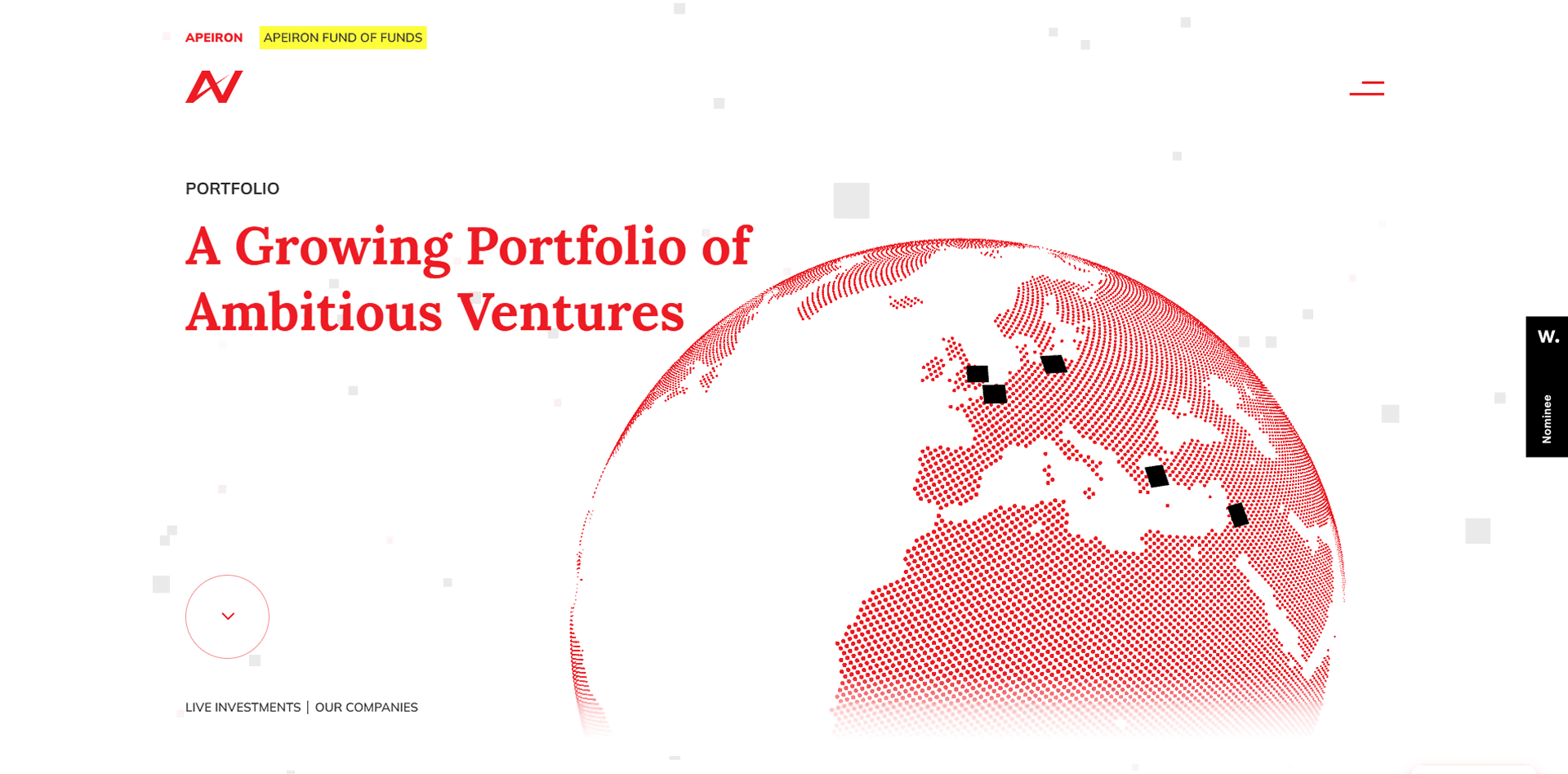
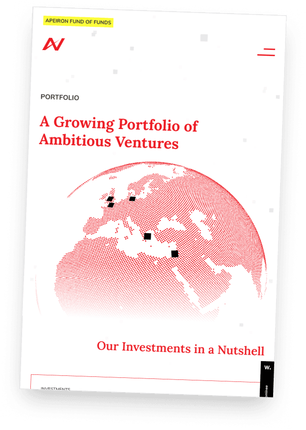
Live investments and global reach, presented through the fund's own halftone-map identity.
Fund size, thesis, and stage — the facts a founder or LP needs before reaching out.
Venture news, updates, and founder stories from across Apeiron's portfolio.
The site launched and won a nomination by Awwwards — the international benchmark for web design excellence. A Greek VC fund, now with a digital presence that competes on a global stage.
More importantly, it does what it was designed to do: it communicates ambition before a single word is read. Founders and limited partners alike arrive at a site that feels as serious and forward-thinking as the fund itself.